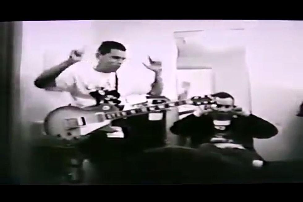
14 Terrible Hardcore Album Covers
The first hardcore records I ever purchased found their way into my hands largely because of their cover art: specifically, the Dead Kennedys’ In God We Trust, Inc., and the Misfits’ "Die, Die My Darling" single. The striking image adorning the latter — a recreation of a 1953 cover of Chamber of Chills magazine executed by Septic Death’s Pushead — eventually made its way onto the back of a denim jacket of mine courtesy of a member of New York Hatecoreists S.F.A., but I digress.
Albums and singles with truly special artwork tend to leap off the retail rack. They force you to take a closer look and investigate them. Each affords us a story. Obviously, this was more so the case when vinyl LPs were the primary order of the day. Bands utilized these 12-by-12-inch squares as virtual billboards in order to give folks a glimpse into where they were coming from. It didn’t hurt if they looked good on a T-shirt either.
If you think it through, the Misfits were pretty much the Iron Maiden of punk, in that Glenn, Jerry and company’s imagery had always been thematic and impactful. You knew without having to peek very closely which band’s album you were looking at, hence making it iconic.
Fact is, album covers are crucial marketing tools and communicative devices. As punk further morphed into hardcore, the cover imagery became even more alluring, and at times, controversial — see Agnostic Front’s Victim in Pain LP. On first glance, the group’s use of an SS soldier inches away from committing a heinous act could be perplexing. Upon diving into AF’s lyrics, their desire to raise awareness of those oppressed became clear.
On the flip, you don’t ever want your album cover to be considered controversial for the wrong reasons; like, because everyone who sees it agrees that it’s rather embarrassing for the band and fans alike. Beauty may indeed be in the eye of the beholder; however these here hardcore turds — some of which are even decent musically — STINK visually in a “what the hell were they thinking” sort of way. See for yourself.

CRUMBSUCKERS, BEAST ON MY BACK
B.O.M.B. is unilaterally considered to feature one of THE worst covers in hardcore history. Portrait-style band photos are generally a bad idea for album art, but if you’re going to use one and you see something like this on a contact sheet, keep it moving and go with plan B! Anything would have been an improvement. ANYTHING!

D.R.I., 4 OF A KIND
It’s bad enough that the once mighty D.R.I. — the band that had more to do with implementing excessive speed than anyone, when it came to hardcore and thrash metal alike — had jumped the shark by this point, but this cover is just dopey. Crap idea and poorly executed. Made a pioneering band look a whole lot more like the shite acts trying to emulate them.

TURNSTILE, NONSTOP FEELING
America’s hottest young hardcore band certainly isn’t immune from visual missteps. Vocalist Brendan Yates is no Ray Cappo, nor is the photo adorning Nonstop Feeling anywhere near as exciting as some of the even lesser shots of the Youth of Today frontman. This kid sure loves having his shirt off. Fair enough, but Turnstile need to do a better job matching the group’s imagery to its overall creativity level, which by all accounts, is quite high. Oh, and Living Colour want their font back!

UNIFORM CHOICE, SCREAMING FOR CHANGE
Is it a painting? Is it a photo? I never understood the graphic treatment on this thing. I suppose it made UC’s debut long-player look an awful lot like it featured a Minor Threat image as its cover by mistake. It also looks like the kid screaming along with Pat Dubar has a microphone growing out of his nose and into Pat’s mouth, but whatevs. At least they had those crucial “straight and alert” tees for their fans to rock with pride.

COMIN’ CORRECT, ONE SCENE UNITY
Yeah, this shit’s just bad no matter how you look at it. Why would any band want to present someone on a cover — a fan, maybe — with a bad band logo tattoo on their hand, moments after what looks like a suicide by wrist-slitting? And who drew this, a CC/25 ta Life superfan from the Baltics who agreed to do it in exchange for some bootleg NYHC demo??? Oof!

MDC, SMOKE SIGNALS
So, the sun is looking up and watching a plane skywriting “MDC” over a post-apocalyptic landscape, all the while trying not to collide with a guitar with what looks like a dog in it, as well as some space-related stuff. Seems legit!

BANE, THE NOTE
The only redeeming quality of this cover illustration is that the pinkie finger on the victim’s right hand indicates a stroke, thus allowing first-responding EMTs to know how to treat said victim. Otherwise, it’s straight-up awful.

SSD, HOW WE ROCK
Yup, the same band responsible for The Kids Will Have Their Say plopped this one on us, too, so why shouldn’t its cover be as generic as their debut is iconic?

DR. KNOW, WRECKAGE IN FLESH
You know the airbrushing booth at street fairs and county fairs? You can get a cheesy design on a shirt or trucker hat. Don’t get your album cover made there!

EARTH CRISIS, FIRESTORM
A close-up of some flames … and they’re not even cool-looking flames.

BAD RELIGION, STRANGER THAN FICTION
These same guys, who have one of the greatest logos in hardcore punk, look like a bunch of schlubby SoCal undergrads here. Decent enough album, but the jacket screams “we stopped trying” in the same way metal bands wearing sweatpants on stage might.

WARZONE, OPEN YOUR EYES
I know, it’s considered sacrilege to knock anything Warzone, but with all due respect to the sadly departed Raybeez, the Open Your Eyes cover reeks! I’m assuming the idea sounded a lot better at the time of conception than the result allows. Tough one.

BAD BRAINS, RISE
I have no idea what’s going on here, but I’m sure it seemed like a decent concept after a bunch of pulls from the chalice.

BLACK FLAG, SLIP IT IN
Nope, never could tell what was happening with this one either.
More From CLRVYNT